
In today’s hyper-connected digital landscape, users access websites through an ever-expanding array of devices-smart
phones, tablets, laptops, desktops, smart TVs, and even wearable tech. With this diversity in screen sizes and resolutions, responsive design services are no longer a luxury-they’re a necessity.
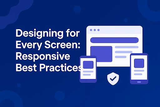
Responsive web design ensures your site adapts seamlessly to any device, offering users a consistent, engaging, and optimized experience. But creating a responsive website goes far beyond just making things “fit.” It requires a thoughtful strategy, robust development practices, and a mobile-first mindset. In this article, we’ll explore the best practices in responsive design that can help brands thrive in a multi-device world.
1. Start with a Mobile-First Approach
Why it matters: Mobile traffic accounts for over 60% of global web traffic. Designing for mobile-first ensures the core experience is accessible, fast, and optimized for small screens.
Best practice: Begin by designing layouts, navigation, and interactions for mobile devices. Then progressively enhance the design for larger screens using media queries. This approach guarantees that content and functionality are prioritized effectively for all users.
2. Use Flexible Grid Layouts
Why it matters: Rigid layouts break on smaller screens, leading to poor usability and user frustration.
Best practice: Implement a fluid grid system using relative units like percentages, em, or rem instead of fixed pixels. Frameworks like Bootstrap or CSS Grid can streamline this process, making layouts adaptive and scalable across devices.
3. Optimize Typography and Readability
Why it matters: Text that’s too small or poorly spaced on mobile screens hampers readability and increases bounce rates.
Best practice: Use responsive typography that adjusts font sizes based on screen width. Maintain an optimal line height (1.4–1.6), and avoid long line lengths (45–75 characters per line). Google Fonts and modern CSS make scaling fonts across devices straightforward.
4. Prioritize Performance
Why it matters: Mobile users often browse on slower networks. A bloated site leads to long load times and poor user experience.
Best practice: Compress images, defer non-critical JavaScript, and use lazy loading for media. Tools like Google PageSpeed Insights and Lighthouse help monitor and improve performance. Choosing lightweight, responsive design services ensures a fast, mobile-friendly website that ranks well on search engines.
5. Make Navigation Intuitive
Why it matters: Navigation patterns vary by device. What works for desktop may overwhelm users on mobile.
Best practice: Use hamburger menus or bottom tab bars on mobile, but ensure visibility and accessibility. On larger screens, provide a horizontal nav bar or mega menu for deeper site structures. Always test across devices to validate usability.
6. Leverage Breakpoints Effectively
Why it matters: Breakpoints define when your layout should change to accommodate different screen sizes.
Best practice: Use common breakpoints for mobile (≤768px), tablet (769px–1024px), and desktop (≥1025px), but base them on your content-not just device widths. Custom breakpoints can better suit your audience’s unique device mix.
7. Test Across Real Devices
Why it matters: Emulators help, but real-world testing uncovers layout bugs, performance issues, and usability flaws that tools often miss.
Best practice: Regularly test your website across actual smartphones, tablets, and desktops. Services like BrowserStack or LambdaTest offer cross-device testing, while SEO tools such as a Google Index Checker validate that all your responsive versions are actually discoverable by search engines.
8. Embrace Touch-Friendly Design
Why it matters: On mobile devices, users interact with touch-not mouse or keyboard.
Best practice: Ensure buttons and links are large enough (minimum 44×44 pixels), avoid hover-only interactions, and provide clear feedback on taps. Prioritize gesture-friendly UI elements for a smoother mobile experience.
9. Optimize Images and Media for All Screens
Why it matters: Images can drastically slow down a site and render poorly on high-resolution displays.
Best practice: Use srcset and picture elements to serve different image versions based on screen size and resolution. SVGs are also great for icons and illustrations due to their scalability and performance benefits.
10. Partner with Experts in Responsive Design Services
Why it matters: Building a truly responsive site requires deep technical knowledge and a nuanced understanding of user behavior across devices.
Best practice: Collaborate with experienced agencies or professionals who specialize in responsive design services. They can ensure your site performs seamlessly on every screen-boosting usability, SEO, and conversions.
Conclusion
Responsive design is no longer optional-it’s the standard. With users accessing the web from virtually every screen imaginable, delivering a consistent and optimized experience is crucial to maintaining engagement and driving business success.
By following these responsive design best practices, brands can create websites that are future-proof, user-friendly, and conversion-ready. Whether you’re redesigning an outdated website or building a new digital product, partnering with trusted responsive design services can make all the difference.